
|


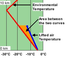
In an unstable environment, the temperature of rising air can be traced and compared to the vertical profile of the environmental temperature.
| The area between these two lines is representative of the available energy a storm could use to grow. This energy is call CAPE (Convective Available Potential Energy) and comes from the energy released when water condenses. |
|
Meteorologists use more sophisticated diagrams (like the skew-T diagram below) to determine the relationship between the temperatures of the environment and the rising air. Here the red line still represents the environmental temperature.
This movie shows surface air which is lifted into unstable air. The thin yellow line is tracing the rising air's temperature. The orange area between these curves is related to the amount of CAPE present.
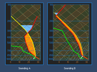
There are two aspects of CAPE that meteorologists look at when diagnosing severe storm potential -- the size and the distribution of the orange area. The size (or magnitude) of CAPE is important as it describes the potential strength (e.g. updraft speeds) within storms. However the distribution of CAPE is just as important. This is because the same CAPE (orange area) could come from an environment with a large temperature difference over a shallow level or from a smaller temperature difference over a deeper level. The diagram below shows this. The orange areas (and therefore CAPEs) are identical.
The original source of this image is the Cooperative Program for Operational Meteorology, Education and Training (COMET®) of the University Corporation for Atmospheric Research. Copyright © 1996 University Corporation for Atmospheric Research. All Rights Reserved
Notice how in the sounding A, the difference in temperature between the environment and the rising air is much greater than in sounding B. This means that the rising air in sounding A is more buoyant with respect to its environment than that of the air rising in sounding B. Stronger updrafts and more severe storms are likely in sounding A.
|
wind shear |
|
NCSA Access Article |