
|
Sometimes the reported values (black numbers) are not always located between the correct contours. For example, in the dew point temperature map below, a station in Minnesota (circled in blue) reported a dew point temperature of 52 degrees, but it is located between the 60 and 65 degree contours.
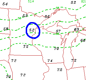
Why is this so? Because contours are plotted to provide a "best-fit" for all reports, which include a very large number of stations. To give you an idea, I've increased the number of reporting stations in the image below.
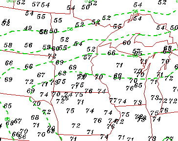
This is the exact same dew point map, but with many more station reports (black numbers). And this still doesn't include all of them!
In order for every station to be within the correct contours, lines would be zigging and zagging everywhere, making the map unreadable. Fortunately, contour lines are smoothed to make the map readable.
Therefore, it is important to remember that although the contours may not be 100% accurate for every single reporting station, contouring provides READABLE information, as accurately as possible, for a HUGE number of reporting stations.
|
isodrosotherms |
|
Temperature Maps |