
|


The black arrows plotted on this image are wind vectors. These vectors indicate direction and intensity of the wind. The vectors point in the direction to which the wind is blowing and in this image, winds are primarily blowing from west to east. Intensity of the wind is conveyed through the size of the vector. The longer the arrows, the stronger the winds.
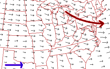
For example, wind vectors in the vicinity of the blue arrow are longer than those near the green arrow. This means that by the blue arrow, the winds are stronger, than by the green arrow. Wind vectors are also useful in finding regions of upper level convergence and divergence, which indicate regions of upward and downward motion. Upward motion is typically associated with clouds and precipitation.
Below is an ETA Model forecast panel for 300 mb winds and geopotential heights (white contours). The color filled regions indicate wind speed in knots and is color coded according to the legend at the bottom of the image. The shades of blue indicate winds less than 60 knots, while winds greater than 100 knots are given in shades of red.
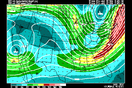
The wind vectors (red arrows) are much smaller in the blue regions, where the winds are relatively weak, and largest in the red, which is the region of strongest winds. The ribbon of strongest winds (green, yellow and red colors) is called the jet stream with a jet maximum, or jet streak located along the east coast.
Notice how the wind vectors are aligned generally parallel to the geopotential height contours. Once high enough above the earth, the effects of surface friction on wind direction decrease dramatically and consequently, winds flow roughly parallel to the height contours.
|
mid-level moisture |
|
Severe Storms |